Learning ggplot2
Posted on March 18, 2017
Here is a short example intro to ggplot2. For this we’ll work with the mtcars dataset.
knitr::kable(head(mtcars),
caption = "Top Rows of mtcars dataset")| mpg | cyl | disp | hp | drat | wt | qsec | vs | am | gear | carb | |
|---|---|---|---|---|---|---|---|---|---|---|---|
| Mazda RX4 | 21.0 | 6 | 160 | 110 | 3.90 | 2.620 | 16.46 | 0 | 1 | 4 | 4 |
| Mazda RX4 Wag | 21.0 | 6 | 160 | 110 | 3.90 | 2.875 | 17.02 | 0 | 1 | 4 | 4 |
| Datsun 710 | 22.8 | 4 | 108 | 93 | 3.85 | 2.320 | 18.61 | 1 | 1 | 4 | 1 |
| Hornet 4 Drive | 21.4 | 6 | 258 | 110 | 3.08 | 3.215 | 19.44 | 1 | 0 | 3 | 1 |
| Hornet Sportabout | 18.7 | 8 | 360 | 175 | 3.15 | 3.440 | 17.02 | 0 | 0 | 3 | 2 |
| Valiant | 18.1 | 6 | 225 | 105 | 2.76 | 3.460 | 20.22 | 1 | 0 | 3 | 1 |
Summary of mtcars
library(dplyr)
m <- mtcars %>%
  select(mpg, cyl, hp)
summary(m)
## mpg cyl hp
## Min. :10.40 Min. :4.000 Min. : 52.0
## 1st Qu.:15.43 1st Qu.:4.000 1st Qu.: 96.5
## Median :19.20 Median :6.000 Median :123.0
## Mean :20.09 Mean :6.188 Mean :146.7
## 3rd Qu.:22.80 3rd Qu.:8.000 3rd Qu.:180.0
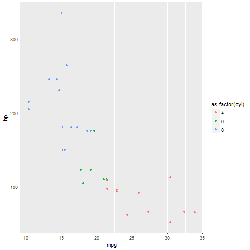
## Max. :33.90 Max. :8.000 Max. :335.0scatterplot
library(ggplot2)
m %>% ggplot(aes(mpg,hp, colour=as.factor(cyl))) +
  geom_point()